Mobile-First Websites That Perform on Every Device
Your customers are on their phones — we make sure your website looks sharp, loads fast, and converts seamlessly on mobile, tablet, and desktop.

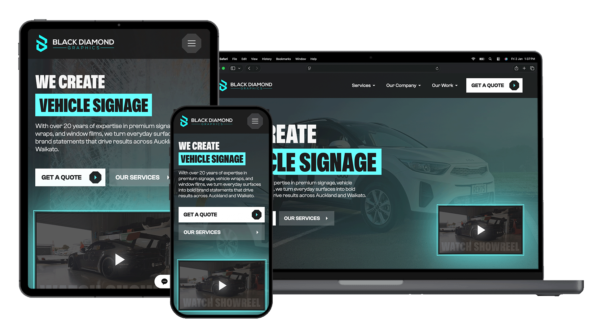
Designed to Work Perfectly on Every Screen
Over half of your website visitors are on mobile. If your site is slow, hard to use, or poorly designed on smaller screens, you’re losing customers before they even read what you offer.
That’s why every Websonic website is built mobile-first — ensuring fast load times, easy navigation, and a seamless experience across all devices.
How We Deliver a Flawless Mobile Experience
Mobile-First Design Approach
We design for mobile first, then scale up to tablet and desktop — ensuring your most important audience gets the best experience.
Touch-Friendly Navigation
Buttons, menus, and forms are built for real thumbs — no tiny links or frustrating taps.
Optimised Images & Media
Images automatically scale and compress for each device, keeping your site fast without sacrificing quality.
Clear, Readable Typography
Text is sized and spaced properly so users can read comfortably — no zooming or squinting required.
Fast Load Speeds on Mobile
We optimise every asset so your site loads quickly even on mobile networks, reducing bounce rates and improving conversions.
Consistent Brand Experience
Your website looks polished and professional across every device — building trust no matter how customers find you.
Common Questions About Mobile Responsive Design
Yes. We design and test your site across modern smartphones, tablets, and desktops to ensure it works seamlessly everywhere.
Yes — and it should. We optimise layouts for each device so mobile users get a streamlined, action-focused experience while keeping your branding consistent.
No. One responsive website adapts to all devices, making it easier to manage, better for SEO, and more cost-effective.
If users need to zoom, struggle to tap buttons, or wait more than a few seconds for it to load — it’s costing you customers. We can audit this for you.
Sometimes, but many older sites aren’t built for modern mobile standards. In most cases, rebuilding properly delivers better performance and results.
For most New Zealand businesses, it’s between 55–75%, and often higher for local services. Mobile isn’t optional — it’s the majority.
Don’t Lose Customers on Mobile
Make sure your website performs where it matters most — on your customers’ phones — with fast, conversion-focused mobile design.